


INDUSTRY
YEAR
2025
SERVICES
INFO
Turkey’s leading ticketing platform, Bubilet, helps organizers reach wider audiences to showcase their events and brings millions of fans closer to their favorite artists. Partnering on creative strategy and rebranding, we transformed their brand identity to reflect their dynamic, youthful spirit in the entertainment industry.
INDUSTRY
YEAR
2025
INFO
Turkey’s leading ticketing platform, Bubilet, helps organizers reach wider audiences to showcase their events and brings millions of fans closer to their favorite artists. Partnering on creative strategy and rebranding, we transformed their brand identity to reflect their dynamic, youthful spirit in the entertainment industry.
Perfection in the details
We dived deep into the details and perfected Bubilet’s logomark to give it a strong visual presence on all platforms, transforming it into an icon fully adaptable across the entire brand ecosystem, from animations to merchandise.
The smooth transition
We made Bubilet’s signature green more vibrant to maintain its strong recognizability and bring the brand’s youthful energy to life. At the same time, switching the logo to all lowercase gave it a friendlier, more approachable presence. These subtle adjustments reflect the meaning behind the name, ‘Bubilet,’ which means ‘this ticket’ in Turkish, emphasizing accessibility over formality.
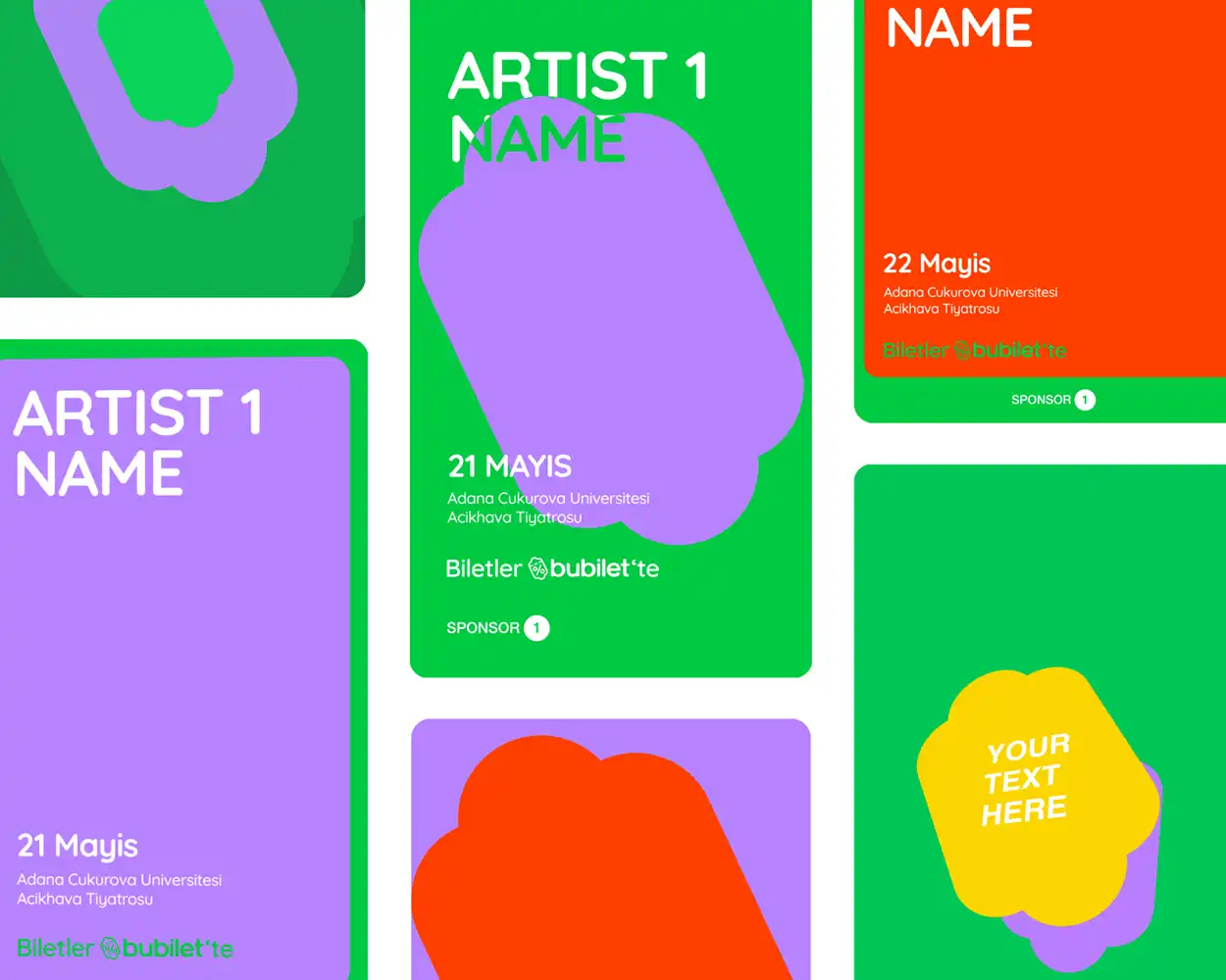
Ready-to-go templates
To keep pace with the fast-moving entertainment world, we created ready-to-use templates for Bubilet, allowing events to be showcased seamlessly across all channels, including their website, app, social media, and more. In order to capture the excitement of each event in motion, we developed special animation templates that extend the brand’s visual communication language.

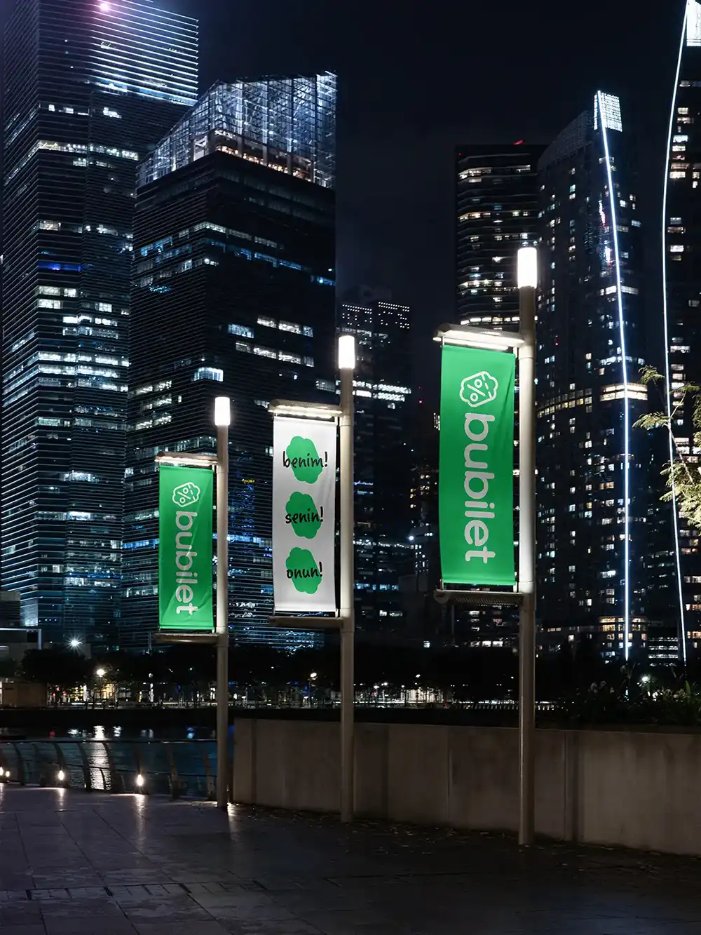
This ticket, your experience
Aiming to highlight the meaning behind the brand’s name (‘this ticket’), we launched a new campaign called “Senin/Benim”, which means ‘It’s Yours/It’s Mine’ in Turkish. The campaign fosters a renewed sense of belonging among customers, emphasizing that each ticket offers an experience that will become a cherished memory.
Perfection in the details
We dived deep into the details and perfected Bubilet’s logomark to give it a strong visual presence on all platforms, transforming it into an icon fully adaptable across the entire brand ecosystem, from animations to merchandise.
The smooth transition
We made Bubilet’s signature green more vibrant to maintain its strong recognizability and bring the brand’s youthful energy to life. At the same time, switching the logo to all lowercase gave it a friendlier, more approachable presence. These subtle adjustments reflect the meaning behind the name, ‘Bubilet,’ which means ‘this ticket’ in Turkish, emphasizing accessibility over formality.
Ready-to-go templates
To keep pace with the fast-moving entertainment world, we created ready-to-use templates for Bubilet, allowing events to be showcased seamlessly across all channels, including their website, app, social media, and more. In order to capture the excitement of each event in motion, we developed special animation templates that extend the brand’s visual communication language.
This ticket, your experience
Aiming to highlight the meaning behind the brand’s name (‘this ticket’), we launched a new campaign called “Senin/Benim”, which means ‘It’s Yours/It’s Mine’ in Turkish. The campaign fosters a renewed sense of belonging among customers, emphasizing that each ticket offers an experience that will become a cherished memory.


Bubilet
İzmir, Turkey
Çağıl Aygen
Çağıl Aygen, Consultant and Designer Valeryia Herasimava, Visual Comm. Designer Öykü Odaman, Graphic Designer Eylül Aytan, Content Specialist
Logo, Logotype, Tagline, Brand Marks, Typography, Color Palette, Pins, Signage, Merchandise, Social Media Assets, Animations, Motion Graphics Templates, Brand Guidelines, Pattern, ID Cards, Website, Mobile Application, Notebook, Presentation


Velvele © 2025
Velvele © 2025